- Dot Dash Pay
Design Tools
- Notebook
- Affinity Designer
- Affinity Photo
- Sketch
Deliverables
- Website
- Illustrations
Design Payment Platform & Brand Assets
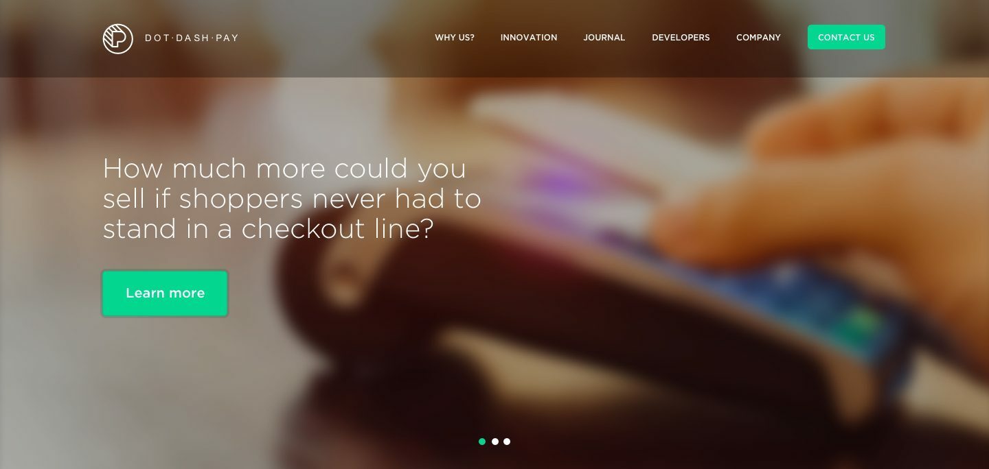
DotDashPay, a forward-thinking payment platform, approached us to revamp their UX/UI design and branding strategy.
The objective was to create an intuitive, client-friendly digital payment experience that caters to both businesses and consumers while ensuring seamless multi-channel integration across various devices and platforms.
Strategy and Process
Project Goals and Challenges
DotDashPay needed a modern payment platform that would offer seamless transactions across multiple devices and channels.
The primary challenge was designing an intuitive user interface (UI) while addressing the complexities of a secure payment system that caters to various user needs, from individual consumers to large enterprises.
Additionally, the platform needed to stand out in a competitive fintech market while maintaining a streamlined, user-friendly experience.
Strategic Approach: Crafting a User-Centric Payment Experience
Our approach focused on understanding the client’s journey from start to finish. We conducted in-depth research to identify pain points, behaviors, and preferences.
The insights gathered informed our design decisions, ensuring the platform would be both functional and visually appealing. The strategy revolved around creating a smooth payment flow, minimizing friction, and ensuring that all features were easily accessible.
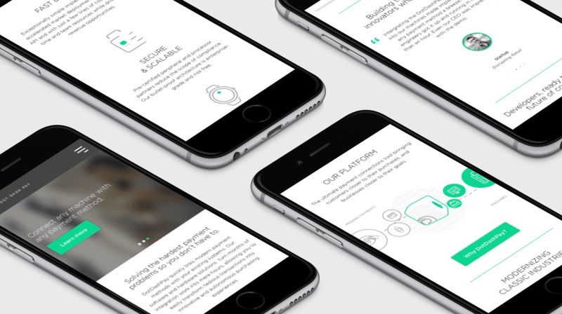
We also prioritized mobile responsiveness, given the growing trend of users relying on mobile devices for financial transactions.
Design Process: From Wireframes to Final Prototype
The design process started with low-fidelity wireframes that mapped out the core functionalities and user flows.
We paid special attention to the placement of key elements like the payment button, navigation menus, and user account options. Once the structure was approved, we moved on to high-fidelity prototypes that integrated DotDashPay’s brand elements and fintech-focused UI components.
Rigorous usability testing was conducted at each stage, allowing us to refine and iterate the designs based on real user feedback.
Branding Strategy: Aligning Visual Identity with Fintech Innovation
To differentiate DotDashPay in the crowded payment solutions market, we crafted a branding strategy that emphasized trust, security, and innovation. The visual identity was built around a clean, modern design language, using a color palette that signified both professionalism and approachability.
We carefully aligned the visual elements with fintech industry standards while incorporating unique brand elements that would make DotDashPay instantly recognizable. The brand’s voice was also tailored to be both authoritative and user-friendly, resonating with both corporate clients and individual users.
01
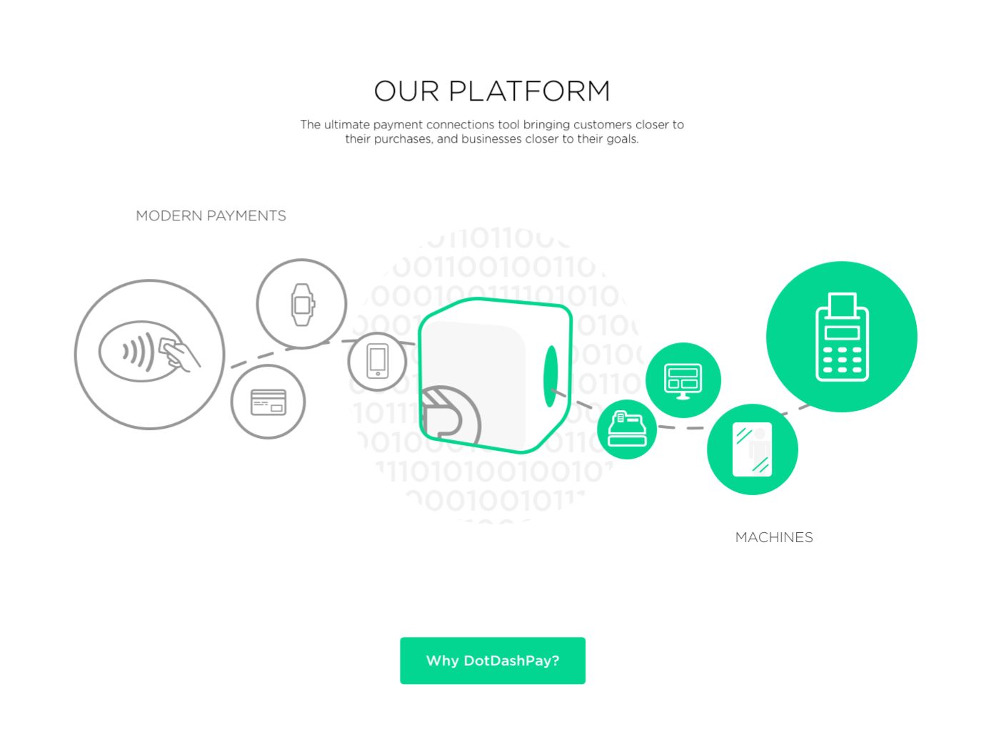
Visual Storytelling Through Custom Illustrations
To effectively communicate complex technical concepts, our strategy involved incorporating custom illustrations that break down information into digestible visuals.
These illustrations are crafted to not only simplify the platform’s functionalities but also to engage the audience by adding an element of creativity and storytelling.
The unique designs align with the platform’s visual identity while guiding users through the payment process with clarity and ease. By blending aesthetics with information, these illustrations play a crucial role in making the platform more accessible and user-friendly.
02
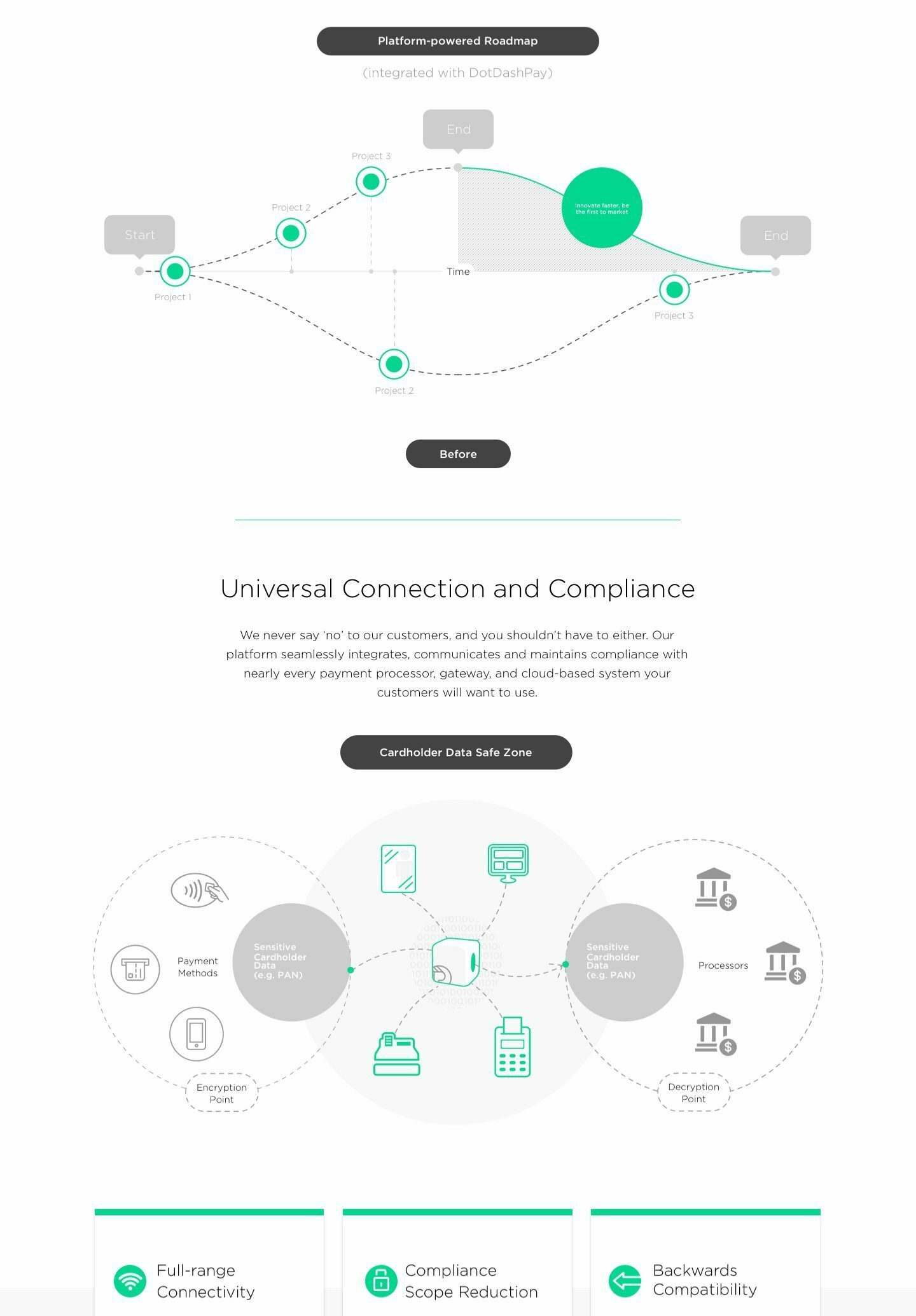
Data Visualization and Custom Diagrams
To further enrich the storytelling and enhance user comprehension, we leveraged custom charts and diagrams derived from the design system. These visuals are tailored to present complex data in a clear, accessible format, making the platform’s capabilities more engaging and easier to understand.
By integrating data visualization into the user journey, we effectively communicated key information while maintaining a seamless visual flow.
These custom diagrams also align with the platform’s branding, ensuring consistency across all touch points. The result is a powerful combination of design and data that showcases the platform’s strengths and elevates the user experience.
![Dashboard of a car with several indicators lit. Text overlay reads, "What if cars could pay for their own gas? Self-checkout is great, but never having to scan an item again? That’s even better. [Need info from DotDashPay].](https://dpprojects.co/wp-content/uploads/2016/12/mobile4.jpg)
03
Interactive Q&A Tiles
To effectively showcase the reliability, responsiveness, and logical flow of the platform’s technology, we created interactive, mobile-friendly Q&A tiles. These tiles not only provided answers but also enhanced user engagement by allowing visitors to explore relevant information dynamically.
Each tile was designed with a focus on user experience, ensuring easy navigation and quick access to critical information.
The content was strategically organized to address common user questions while demonstrating the efficiency of the system. The interactive element of the Q&A tiles was key in making complex details more digestible and engaging for users.
Client Response
”Damion! The new homepage looks great! Nicely done.
Joey MuchaCo Founder
The smaller initial benefits section makes the flow move very nicely.

