
- UX
- Strategy
Design Tools
- Figma
- FigJam
- Notability
Deliverables
- Research
- Strategy
- Wireframes
- Prototypes
Increase Ranchology’s Client Engagement
The primary goal of this project was to optimize user experience (UX) by refining the Reward Tracking Module within the Hidden Valley Ranch Ranchology program.
The focus was on improving customer engagement and satisfaction by identifying areas of friction and addressing them through data-driven improvements.

Project Goals and Approach
Our approach centered on gaining a comprehensive understanding of how clients interacted with the existing module.
This involved conducting stakeholder interviews, performing competitor analysis, and gathering customer feedback. These insights allowed us to pinpoint critical pain points and opportunities for improvement, ensuring our recommendations were grounded in real user experience data.
Objectives:
- Boost Hidden Valley Ranch loyalty and engagement through the Ranchology program.
- Make it clear where members stand in the process of earning their next reward to keep them engaged.
- Increasing badge earning activities is a key performance indicator (KPI).
Audience:
Motivated Ranchology members to collect badges and earn rewards.

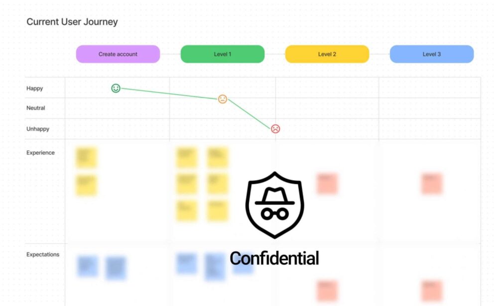
Data Analysis and User Flows
After gathering extensive data, we created detailed user flows and journey maps to visualize how users moved through the reward tracking experience.
This analysis revealed several friction points that were causing confusion and drop-offs. By mapping out these user interactions, we identified key moments where the customer journey could be optimized, allowing us to propose targeted enhancements.
Process
This project started with a discovery phase to assess the module’s current state, understand client needs, and develop potential solutions.
As a result, we delivered a set of recommendations to the client. Working closely with the Hidden Valley Ranch team, we then moved into design and development.
Implementing Data-Driven UX Enhancements
The next step involved implementing these data-driven improvements to streamline the reward tracking process.
We focused on simplifying the user interface, clarifying badge-earning levels, and enhancing the communication around level resets.
These adjustments were designed to reduce frustration, improve overall engagement, and provide a smoother client experience.
Strategy
During the research phase, we identified specific pain points and developed an objective set to guide our design decisions.
Key Recommendations:
- Simplify the Interface: Streamline the design to make it more intuitive and client-friendly, reducing complexity for a seamless experience.
- Consolidate Modules: Group related features to minimize clutter and improve navigation, allowing clients to find what they need more efficiently.
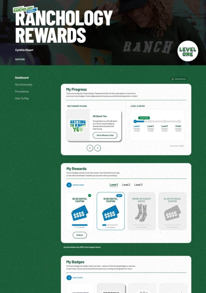
- Redesign the Dashboard: Create a more engaging and visually appealing dashboard that encourages regular interaction and reinforces key actions.
- Add New Features: Introduce elements that drive engagement and reward users, making the experience more enjoyable and motivating.
- Animate Badges: Incorporate subtle animations to celebrate achievements and add moments of delight, keeping users motivated to progress.
Our design phase was guided by these objectives, ensuring that every decision was aligned with our goal of increasing client satisfaction.
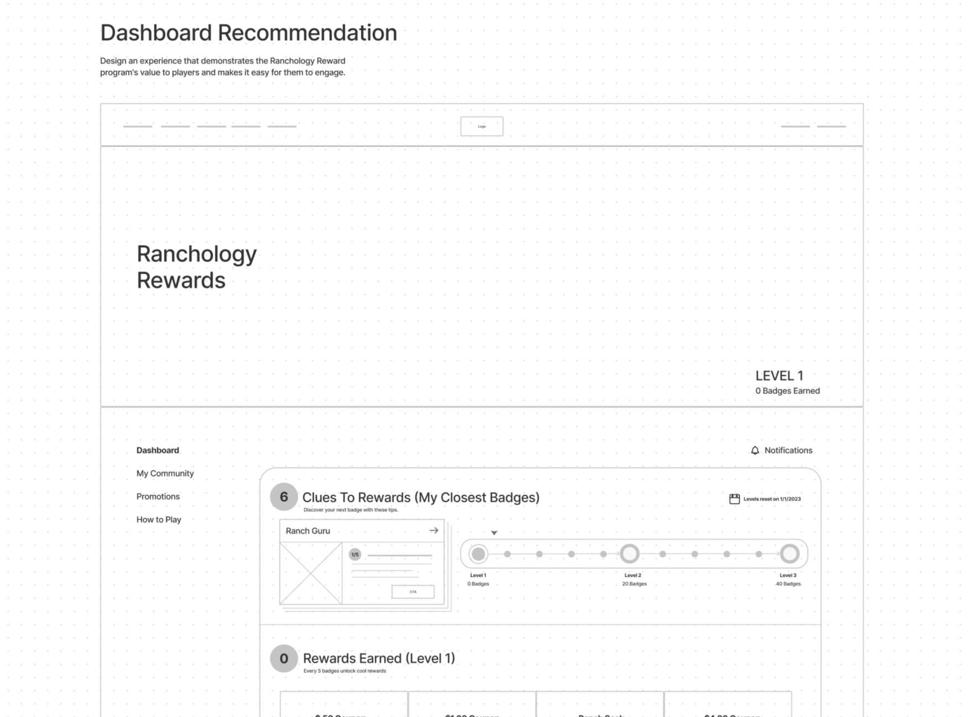
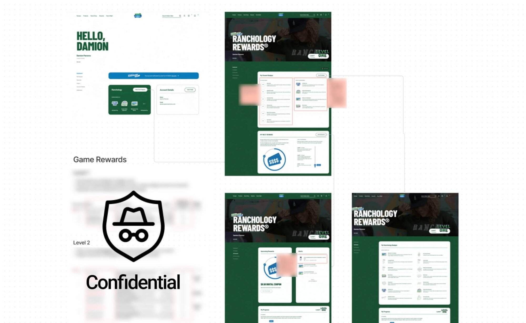
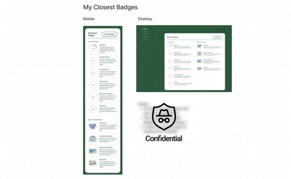
Wireframes
The new features were outlined in detailed wireframes after aligning with the team.
Mobile-First Design:
I took a mobile-first approach to ensure the design worked seamlessly across all devices, prioritizing usability and responsiveness on smaller screens before scaling the design for larger screens. As a result, all users received a consistent and accessible experience.
Simplifying the User Experience:
In order to create a clean and intuitive interface, I carefully evaluated how we could reduce clutter while still delivering all necessary features. As a result, unnecessary elements were removed from the design, functionality was enhanced, and the user journey was more enjoyable.
Addressing Legacy Code Issues:
In addition, we eliminated outdated code that was no longer relevant to the new module. Working closely with engineers, I analyzed the existing code structure and identified potential optimization areas. We improved performance by eliminating redundant features and refining the codebase, resulting in a faster, more efficient user experience.
Client
“The experience has been significantly improved and we’ve seen a positive impact.“
Summary
I’m happy with the result we got on this project. We managed to simplify the client experience while retaining all key functionalities. The final product isn’t just easier to use and more intuitive, but it’s also more engaging and visually appealing.
By balancing simplicity with interactivity, we delivered a solution that enhances user satisfaction and drives meaningful engagement—which we’re proud of as a team.