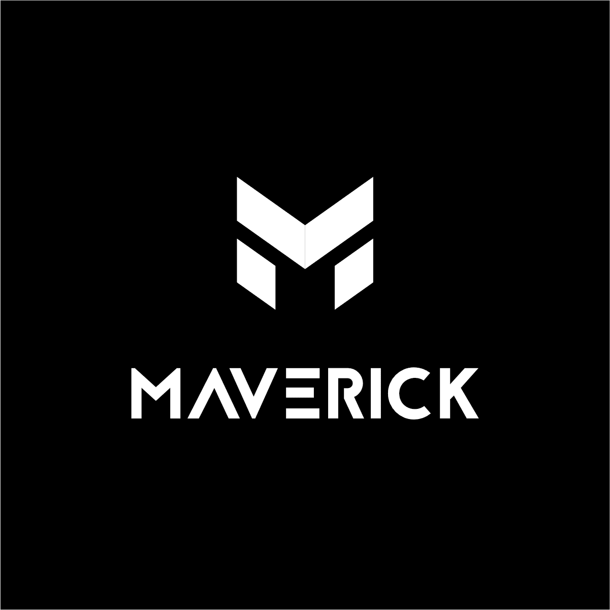
- Maverick Digital
Design Tools
- Notebook
- Affinity Design
- Affinity Photo
- Concept (iPad)
Deliverables
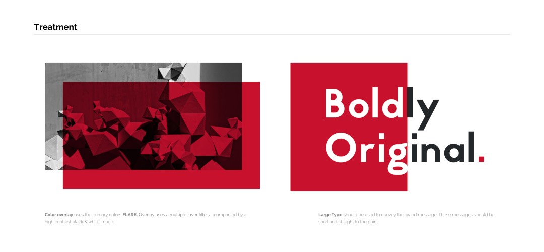
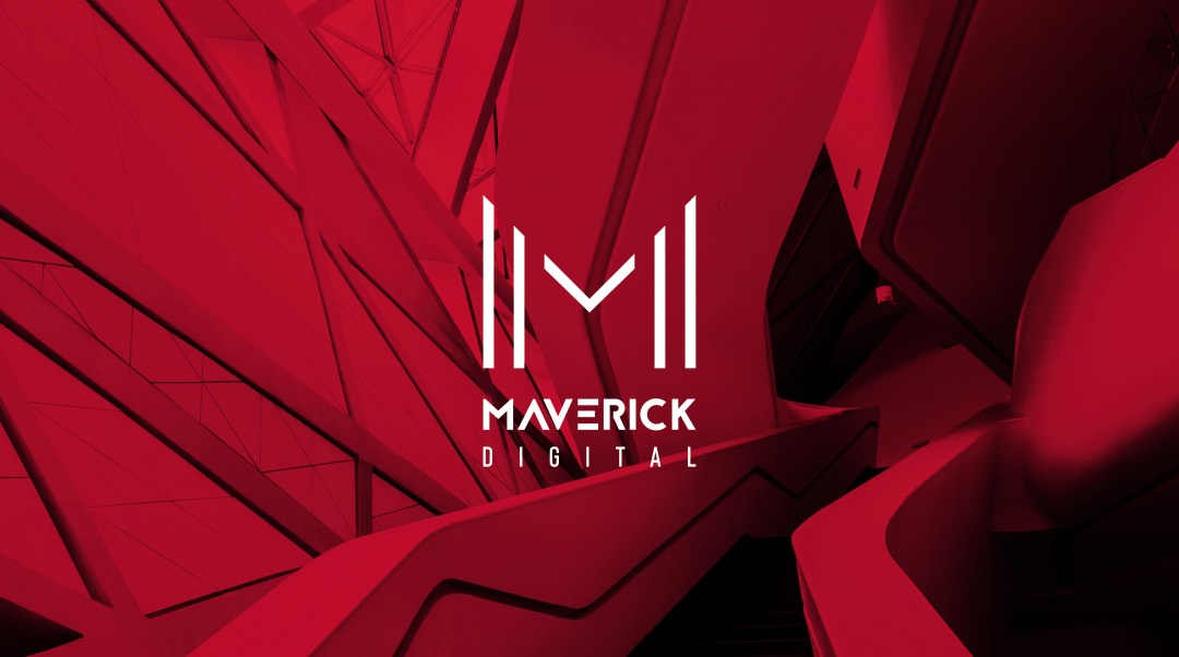
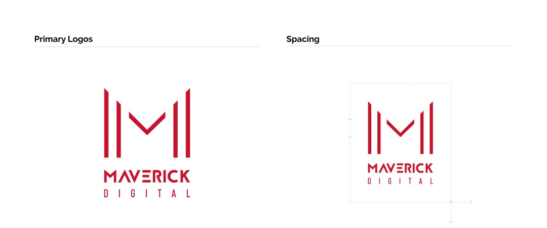
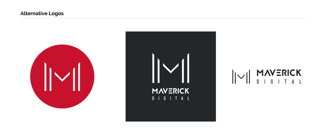
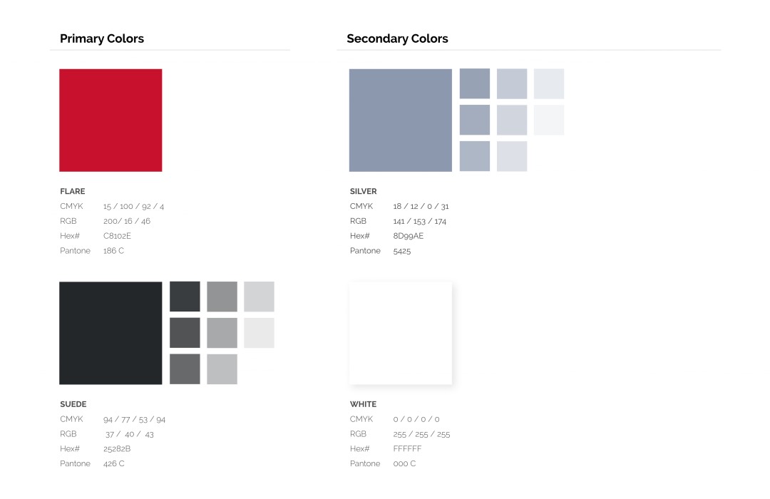
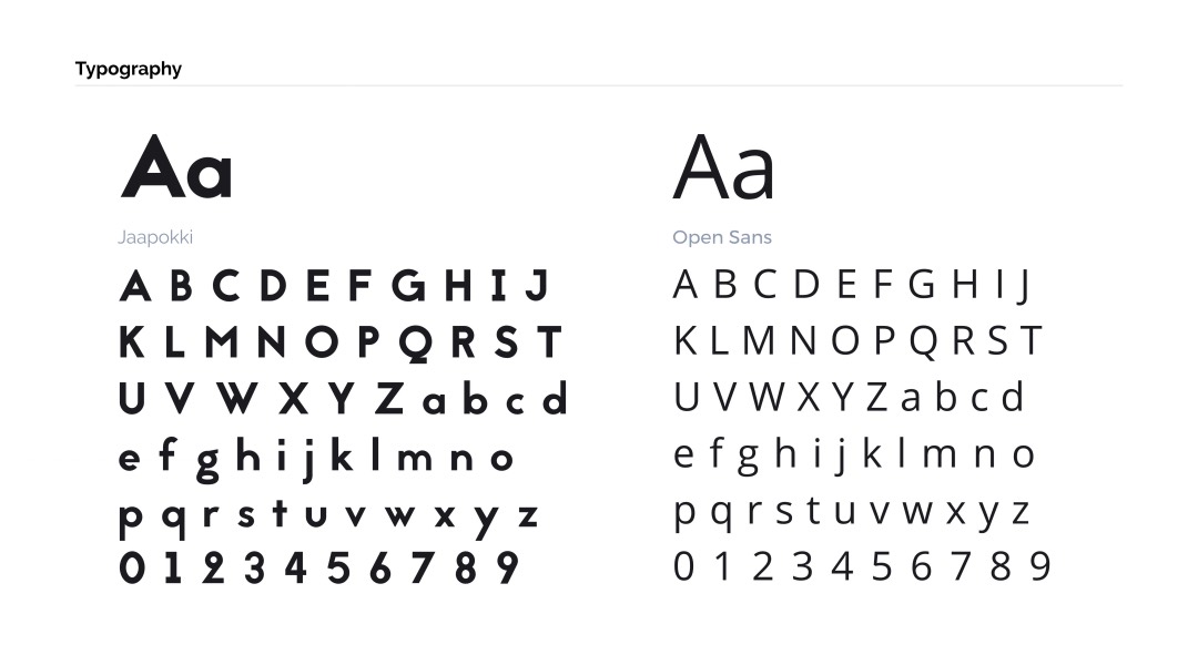
- Brand Identity
Overview & Branding Goals
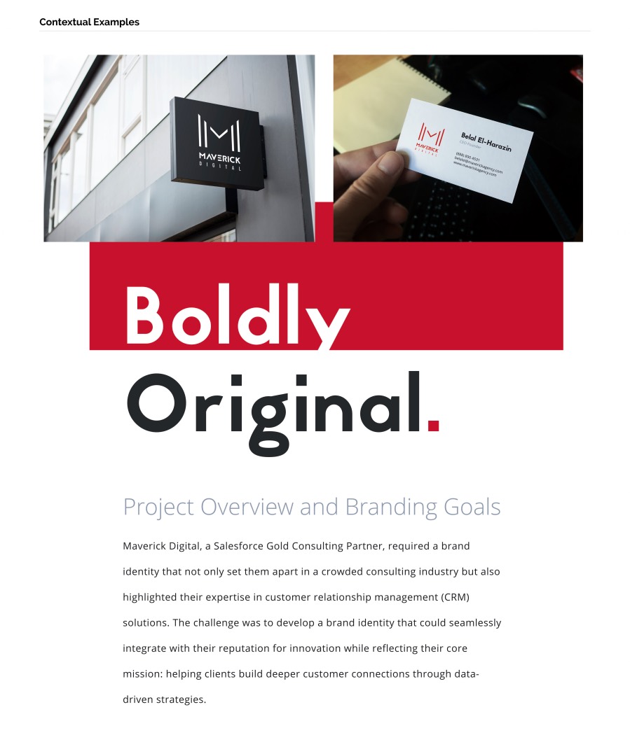
Maverick Digital, a Salesforce Gold Consulting Partner, required a brand identity that not only set them apart in a crowded consulting industry but also highlighted their expertise in customer relationship management (CRM) solutions.
The challenge was to develop a brand identity that could seamlessly integrate with their reputation for innovation while reflecting their core mission: helping clients build deeper customer connections through data-driven strategies.
The primary objective was to create a visual identity that conveyed trust, professionalism, and a forward-thinking approach. The branding needed to be versatile, working across digital platforms, print, and other marketing channels.
Creative Process: From Concept to Execution
The creative journey began with some market research, competitor analysis, and stakeholder interviews. Understanding the industry landscape and Maverick Digital’s unique value proposition was essential to crafting a brand that resonated with both existing clients and new prospects.
Through iterative brainstorming sessions, the team developed a series of concept sketches, each representing different facets of Maverick Digital’s personality. Key themes included innovation, precision, and customer-centricity, which were distilled into a modern, minimalist brand design.

Impact of the Brand Identity on Maverick Digital’s Market Position
The rebranding was not just about aesthetics but also about strategic positioning.
By presenting Maverick Digital as a forward-thinking and trusted Salesforce partner, the new brand identity played an important role in securing larger clients and expanding the firm’s market reach.
Following the brand launch, Maverick Digital reported increased engagement on their digital platforms, with a noticeable boost in website traffic and conversion rates.
The cohesive branding across all touch points—from their website and social media to marketing collateral—reinforced their message of being industry leaders in CRM and system integration services.