Client
iStorage
Design Tools
  • Sketch
  • Affinity Photo
  • Principle
  • Procreate
  • Notability (digital notebook)
Deliverables
  • UX
  • Designs

Size Guide Project Overview and Key Challenges
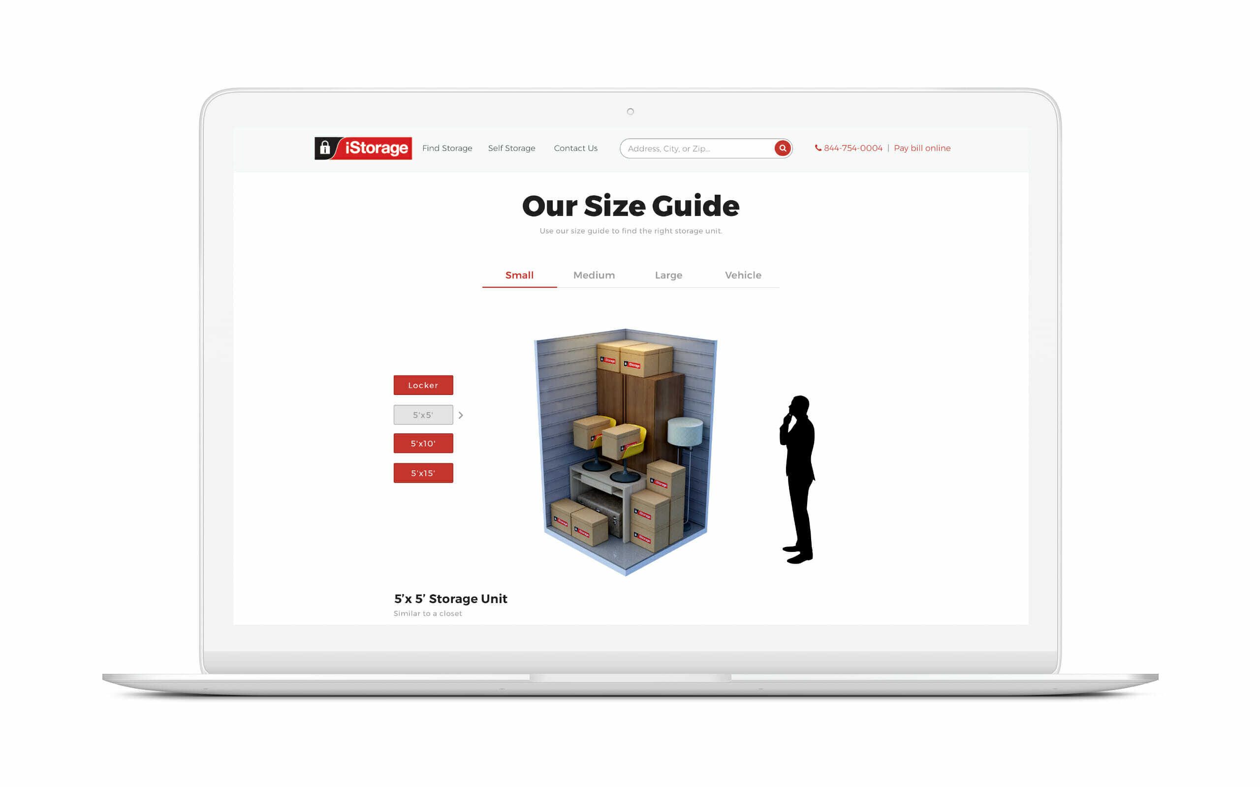
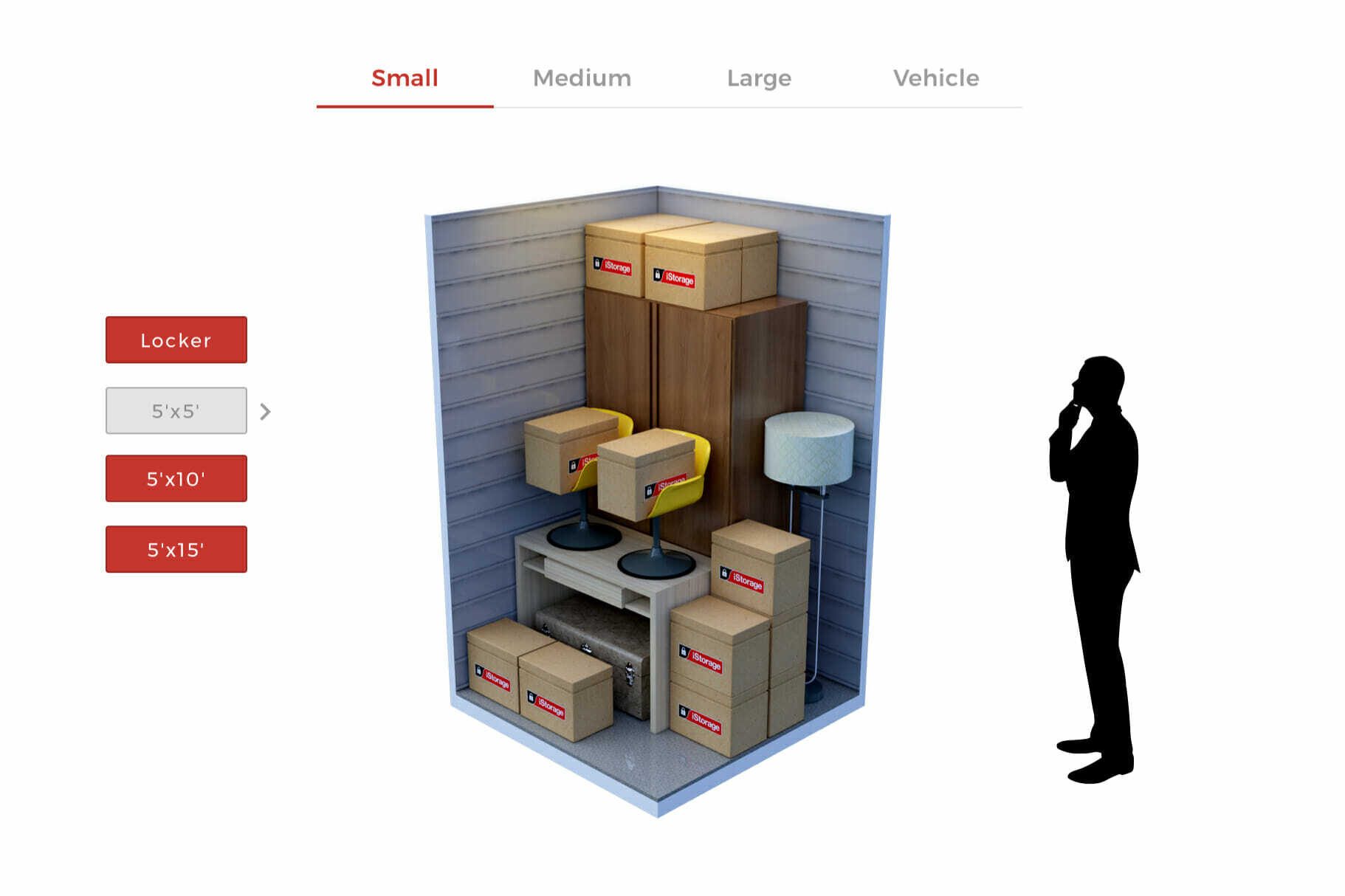
iStorage was facing challenges with users abandoning the reservation process due to confusion about selecting the right storage unit size.

The previous size guide lacked clarity, which led to lower conversion rates and a poor user experience. The primary goal was to redesign the size guide to be more intuitive, visual, and user-friendly, thereby improving customer engagement and boosting reservations.


A laptop screen displays a storage size guide for

User Experience Enhancements in Storage Unit Selection
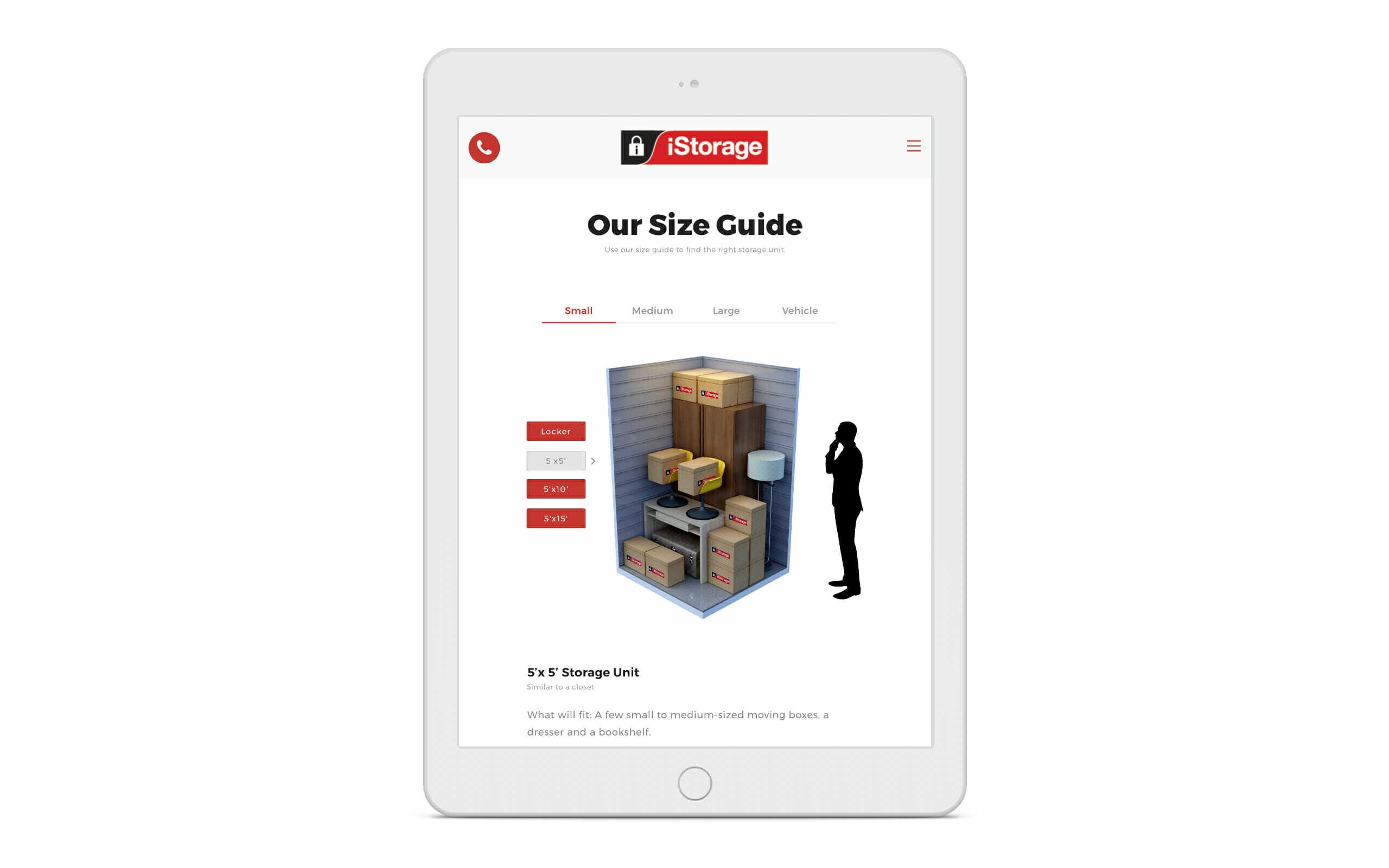
The redesign focused on creating an interactive and visual size guide that simplified the decision-making process.

Key features included an easy-to-use interface with real-time availability checks, cost estimations, and a 3D visualization tool that allowed users to see how their items would fit into various unit sizes.

By integrating these features, users were able to confidently select the right storage unit, leading to increased satisfaction and higher reservation rates.

Image of a tablet screen displaying a

The team highlighted key goals:

    • Customer Engagement: Create interest in products by making customers feel they have something valuable.
    • Confidence in Online Reservations: Ensure customers feel confident reserving a space on the website before visiting the store.
    • Seamless Checkout Experience: Provide a smooth, seamless experience during the checkout process.

Collaborative Design Strategy

The collaborative process involved multiple iterations, starting from initial brainstorming sessions to gathering feedback from both the client and test users.

The team emphasized creating a seamless experience that aligned with iStorage’s brand identity while addressing the key pain points identified in user research.

Advanced 3D visualizations were developed to offer users an accurate depiction of available space, which was crucial in improving engagement.
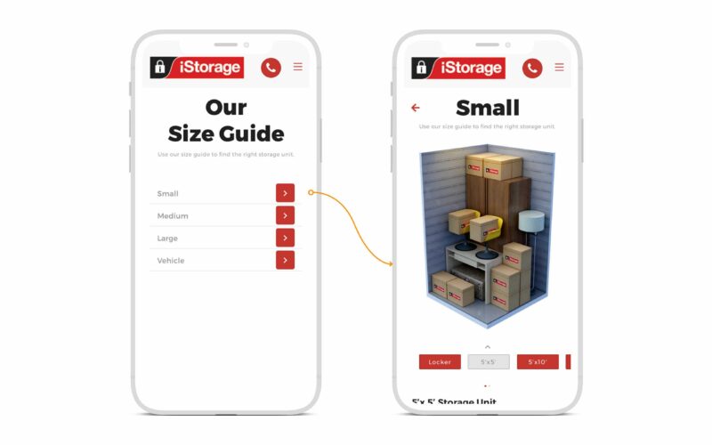
Two smartphone screens showing the iStorage app. The left screen displays size options (Small, Medium, Large, Vehicle), and the right screen shows various boxes in a small-sized storage unit.

Prototype

A prototype was designed to refine decisions and identify potential challenges early in the process.  This approach enabled the team to pinpoint and address issues before committing resources to the final build, ensuring a user-friendly and efficient Size Guide.

Measurable Impact on iStorage’s Reservation Process

The redesigned size guide resulted in significant improvements in key performance metrics:

  • A 5.2% increase in reservation conversion from the ‘Facility Page’ to the ‘Confirmation Page.’
  • A 17.9% increase in reservation conversion from the ‘Reservation Page’ to the ‘Confirmation Page.’
  • A 41% overall increase in web conversion rates.
  • A 78% year-over-year increase in online reservations. The enhanced guide not only simplified the user journey but also led to better decision-making and higher customer satisfaction, proving the redesign’s success.