
- UX
Design Tools
- Mind Node
- Axure
- Figma
- Google Sheets
- Google Docs
Deliverables
- Field Research Report
- Functional Requirements
- Wireframes
- Prototypes
Increase Bookings by Improving UX & Client Engagement
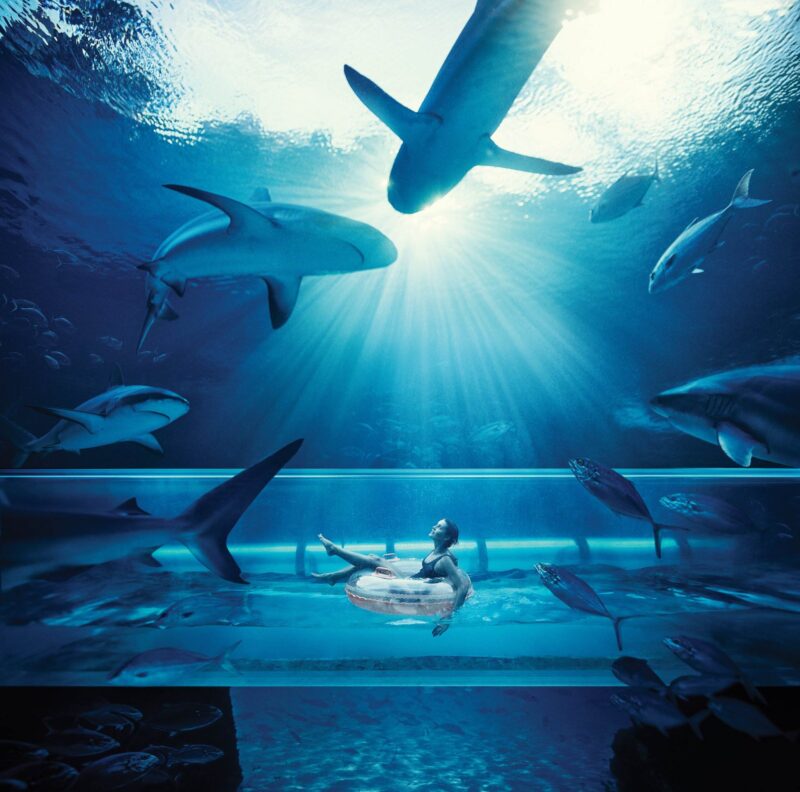
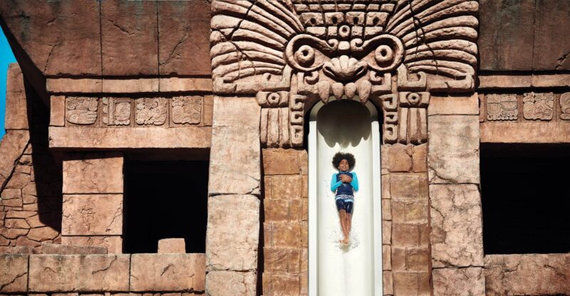
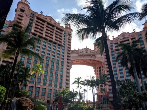
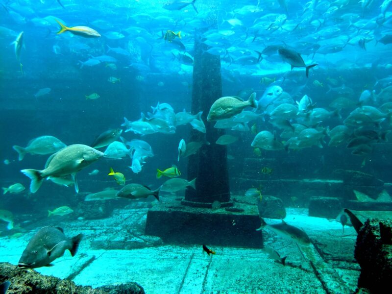
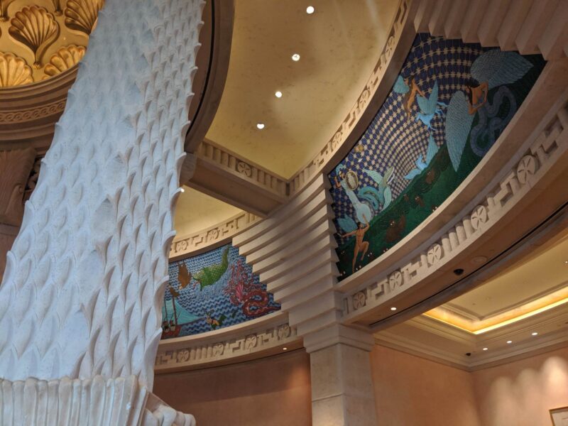
Atlantis is a renowned resort on Paradise Island in the Bahamas with an ocean-themed design. Accommodations are built around Aquaventure, a 62-hectare (154-acre) waterscape featuring lagoons, pools, marine habitats, slides, and river rides.
The project focused on redesigning the digital experience to align with the resort’s grandeur while enhancing guest engagement and driving bookings.
The Ask
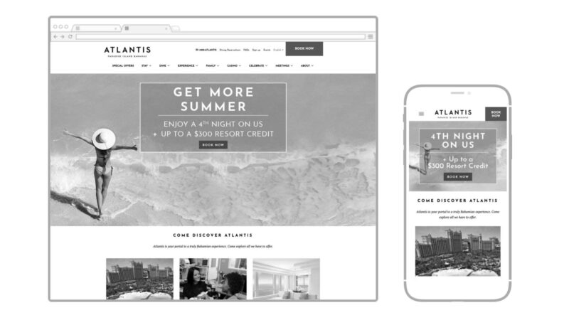
The primary objective was to redesign five critical sections of the website—Home, Specials, Stay, Dine, and Meeting—which are vital for both user experience and business growth.
The redesign needed to:
- Improve UI with a mobile-first approach.
- Leverage immersive video and emotive imagery.
- Boost performance through positive consumer actions and conversions.
- Reflect the “Bahamian Personality” through design.
- Enhance user navigation for diverse accommodation options.
- Create an inspiring and functional initial digital impression that converts visitors into bookings.
Hypothesis
A redesigned website would provide an immersive and user-friendly experience, resulting in higher engagement and increased bookings.
Given the customer behavior metrics
✅ 63% of visitors from mobile
✅ 30% Desktop
✅ 7% Tablet
The mobile-first approach was crucial.

Process
Understanding the customer journey was fundamental. This involved identifying key UX elements across the site, mapping the navigation, and improving the booking process.
Analysis revealed the primary audience as 35-44-year-old females, with children aged 10-12 and a high average household income. The design aimed to align with these demographics by delivering a seamless and intuitive experience.
The breakdown:
- Women 35-44 years old
- Kids average age was 10-12
- Technology Adoption was above average
- Household income averaged 125K-250K
atlantisbahamas.com (2019)
Research
A competitive analysis was conducted to identify market opportunities, followed by a comprehensive site map review.
Heuristic reviews were also performed to resolve usability issues. The goal was to maintain familiarity for returning visitors while introducing exciting and intuitive features that improve content discoverability.
who we evaluated
Field Research
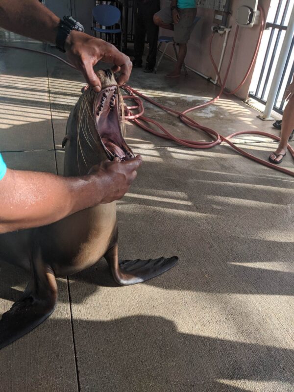
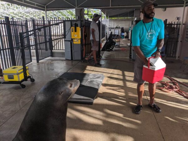
A site visit to Atlantis provided valuable insights into the resort’s layout, ambiance, and brand essence.
Unstructured interviews with staff revealed how guests interact with the resort’s features, which informed UX decisions. An inspiring visit to Dolphin Cay highlighted the brand’s commitment to conservation, further enriching the design strategy.


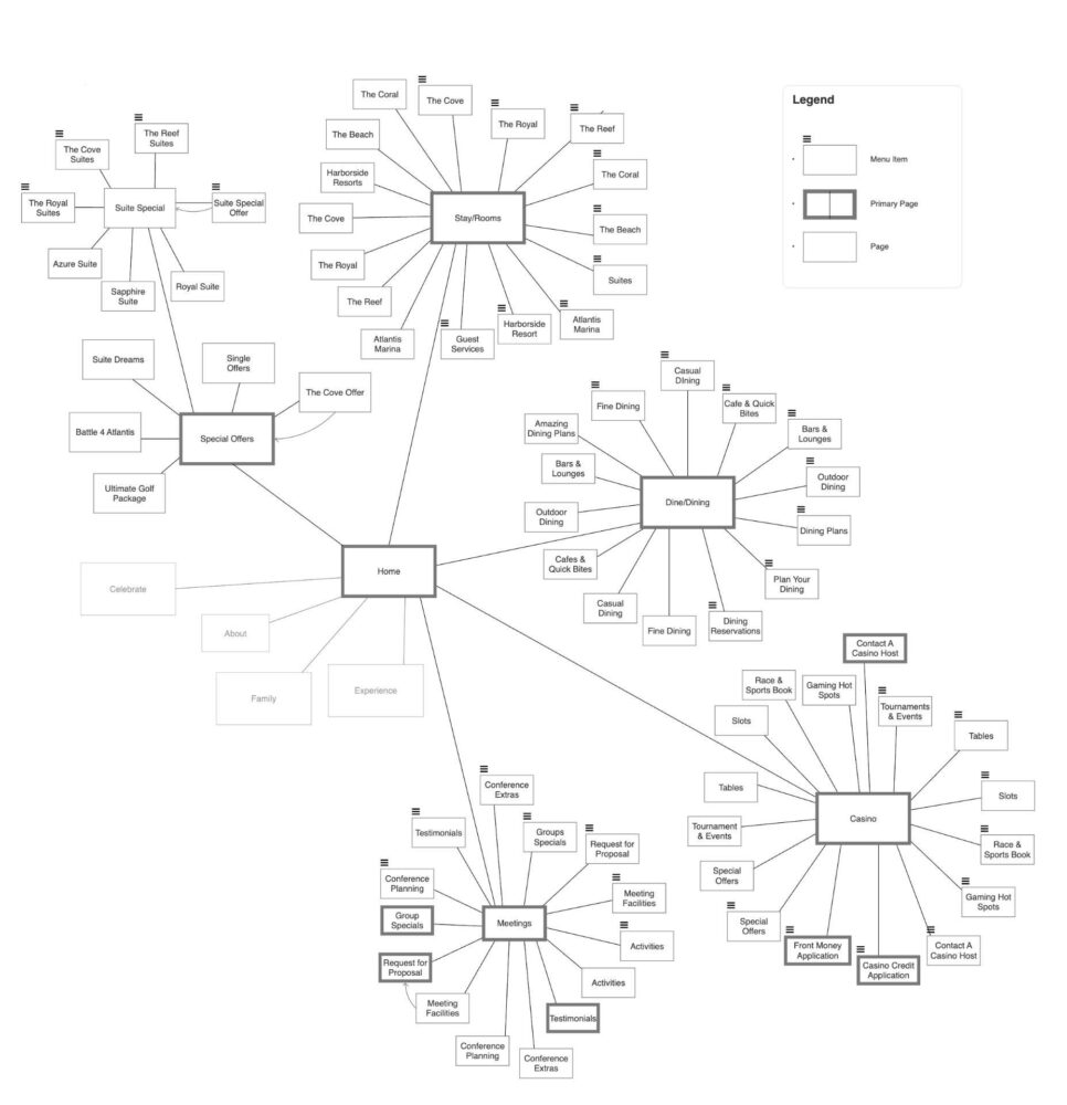
Site Map
The extensive site map review covered over 200 pages, identifying content gaps and prioritizing revisions based on UX needs.
This process also involved creating a transparent design strategy that clarified the flow for both the team and stakeholders.
This process included:
- Identifying changes that were needed
- Prioritizing site map revisions based on priority and user experience
- Creating a flowchart of the current site for reference
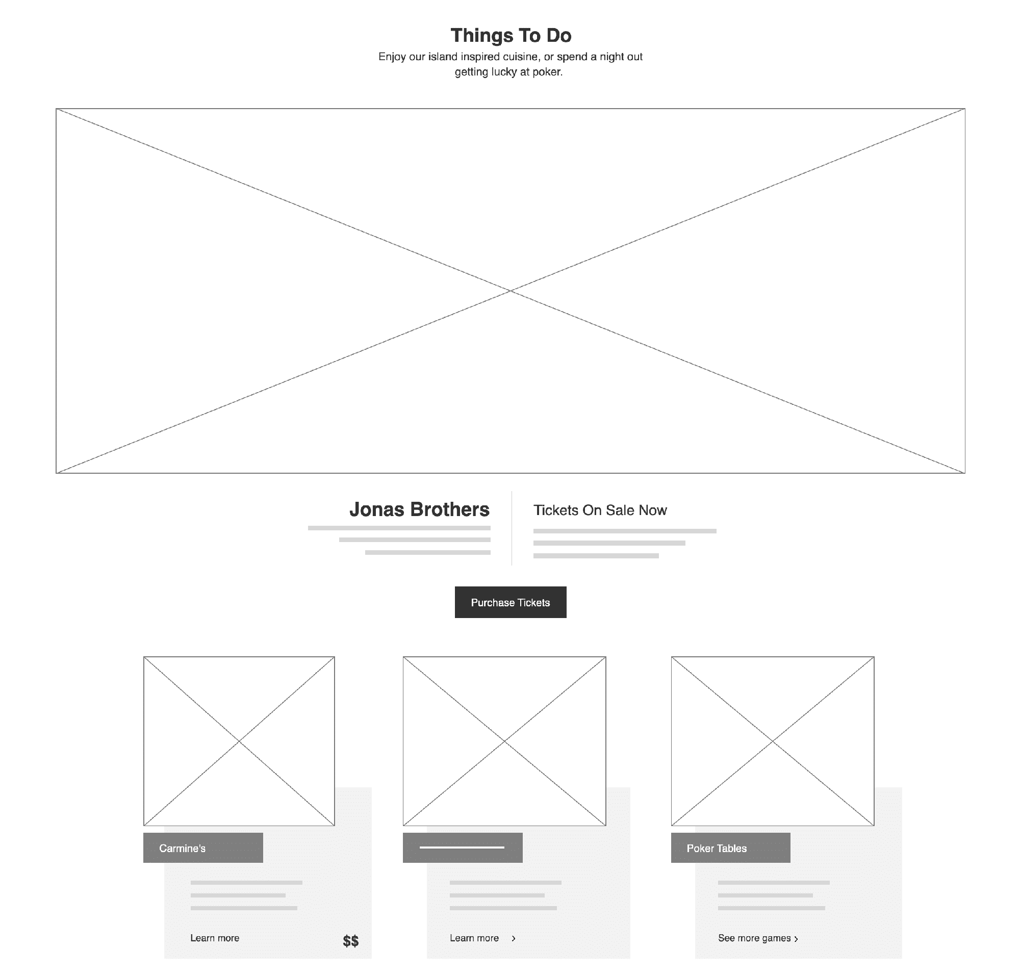
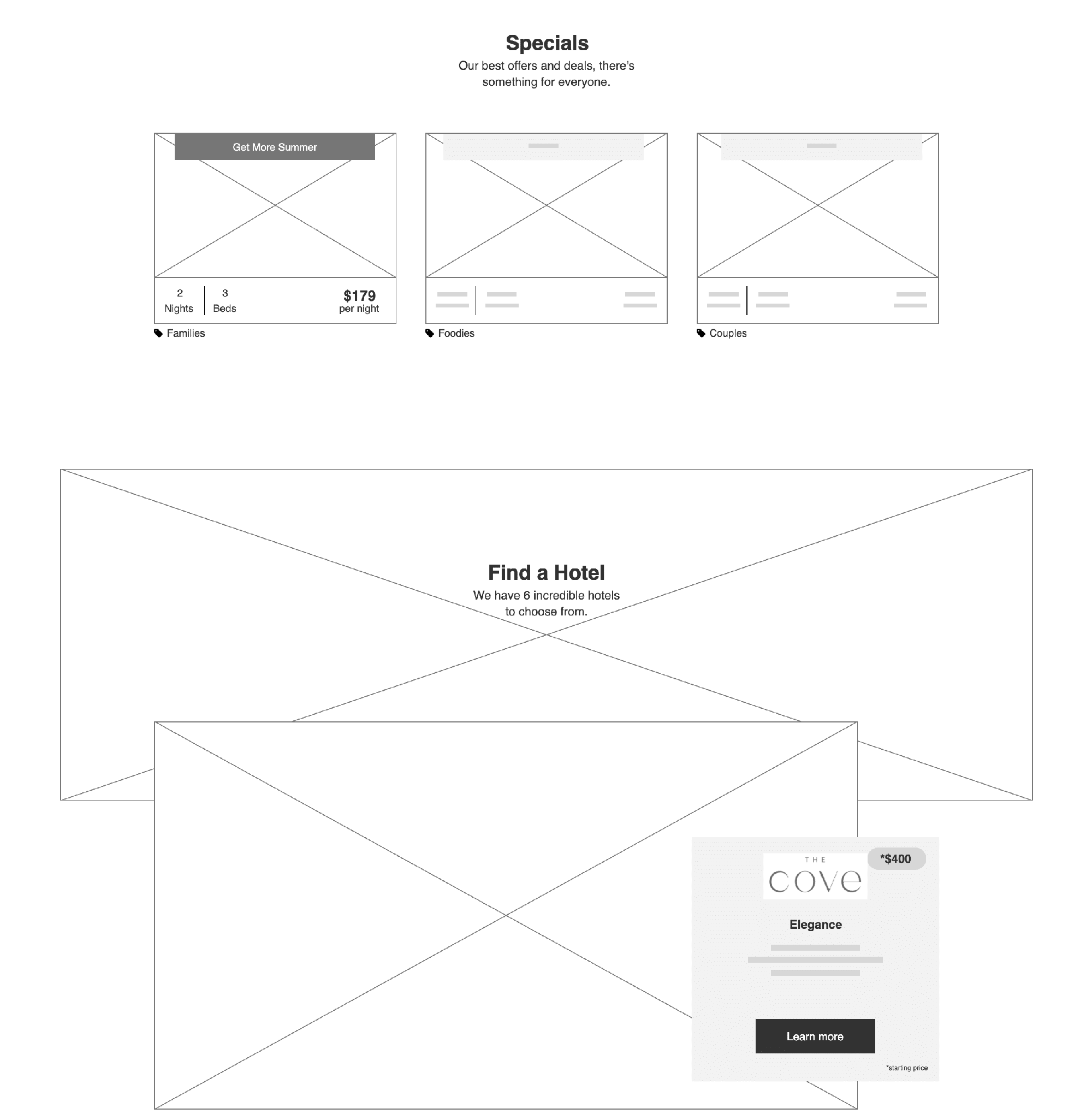
Wireframes
New wireframes were developed to address inconsistencies and streamline navigation.
By providing access to all key features, including offers, news, and on-site activities, the redesigned layout aimed to accommodate the resort’s diverse offerings without overwhelming users.


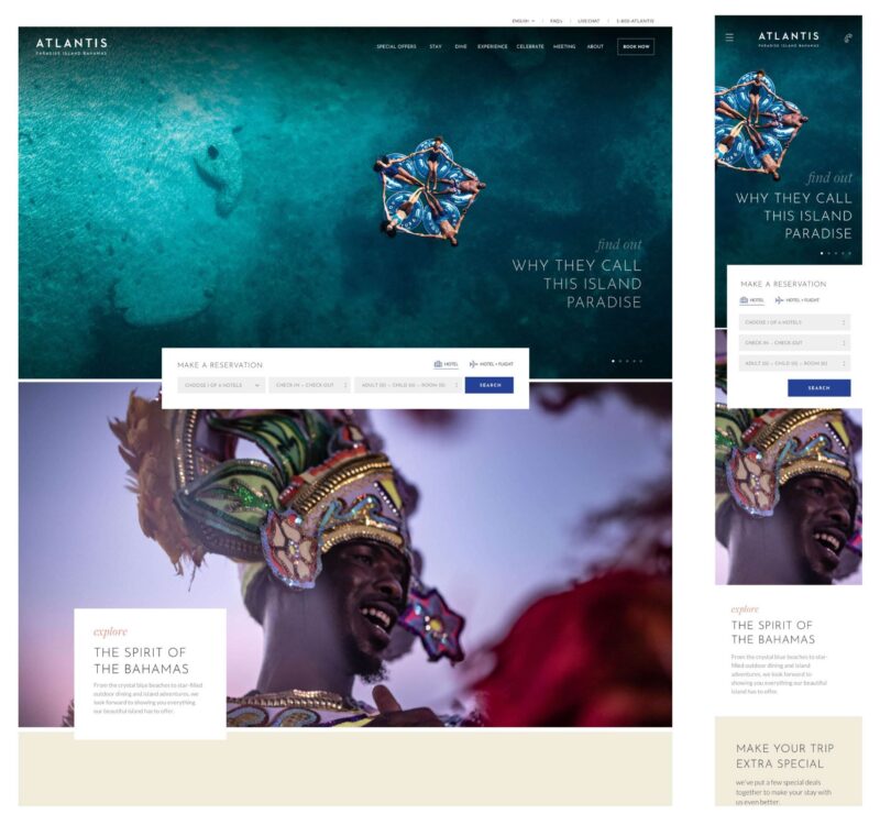
Enhanced Guest Engagement Through Mobile-First Design
The mobile-first approach focused on delivering a responsive experience across devices while retaining the visual and emotive elements essential to the Atlantis brand.
The integration of vivid imagery, optimized navigation, and strategic CTAs ensures that potential guests can effortlessly explore and book their ideal stay.
New templates included global components that could be used on any page. With this approach, any page could easily update its content based on the formula.
With less technical know-how, designers and developers will be able to update websites easily in the future, while still maintaining control over header sizes, footer heights, and other key brand characteristics.
Design
The new website’s color palette, typography choices, and imagery were created in collaboration with the design team so that it would be cohesive and easy to use.
As part of the design process, we aimed to highlight the resort’s historical site while also incorporating elements corresponding to its modern, fun personality.
Results
The redesign of Atlantis Bahamas’ website transformed the digital experience, making it more engaging, user-friendly, and aligned with business objectives.
By focusing on key UX principles, the new design not only improved bookings but also enhanced guest satisfaction through a seamless, visually appealing journey.
Here are some metrics post-launch:
-
The bounce rate on the new site is down from 10.5% to 4.4%
-
The average session length has increased from 4.50m to 7.05m
-
Page views per user have also increased from 6.78 to 9.44
Additionally, the new site is much better at driving people through our sales funnel. By the time they click the book, 80% have viewed the Stay and specials content compared to just 18% before. The design is being followed, leading to higher conversions.
Client