- UX
- Design
Design Tools
- Figma
- Notability
Deliverables
- Research
- Functional Requirements
- Wireframes
- Prototypes
- Design
Client Profile Redesign & UX Improvements
The Neiman Marcus client profile redesign focused on optimizing the user experience (UX) to better serve sales associates and customers in a luxury retail environment.
The primary goal was to enhance the client profile with personalized recommendations based on spending habits, recent purchases, and product preferences. By integrating customer behavior analytics, the project aimed to simplify navigation, improve data visibility, and enable sales associates to deliver more tailored, high-end service.

The Ask
The existing client profile lacked the ability to offer personalized content and recommendations, leading to inefficiencies and difficulties in accessing relevant client information.
The redesigned profile focused on centralizing data, providing intuitive access to client interactions, and supporting better decision-making for sales associates.
Our key business objectives included increasing client data visibility, reducing friction in profile navigation, and improving the overall shopping experience by offering luxury retail UX that drives customer engagement.
Business Goals:
-
Increase client data visibility for sales associates
-
Generate product recommendations for clients
-
Make it easy for sales associates to find relevant client information
-
Reduce the friction associated with profile navigation
Sales Associate Goals:
-
As a sales associate, I want to be able to see my clients’ spending habits, recent purchases, and product recommendations so that I can provide them with tailored recommendations.
-
As a sales associate, I want to be able to quickly find and view relevant information about my clients. This will enable me to provide them with the best possible service.
-
As a sales associate, I want to have access to data that shows me how active my clients are and how often they interact with my recommendations. This will enable me to my service.

Hypothesis
By redesigning the client profile to emphasize personalized recommendations based on client behavior, we theorized that we could increase sales associate satisfaction and efficiency.
As a result of the “Looks to Purchase” feature, which tracks how often clients engage with suggested products, we anticipated an increase in customer interactions and engagement.

UX Enhancements for Luxury Retail
Our process involved a thorough evaluation of the existing UX and gathering insights through user flows, competitor analysis, and eCommerce best practices.
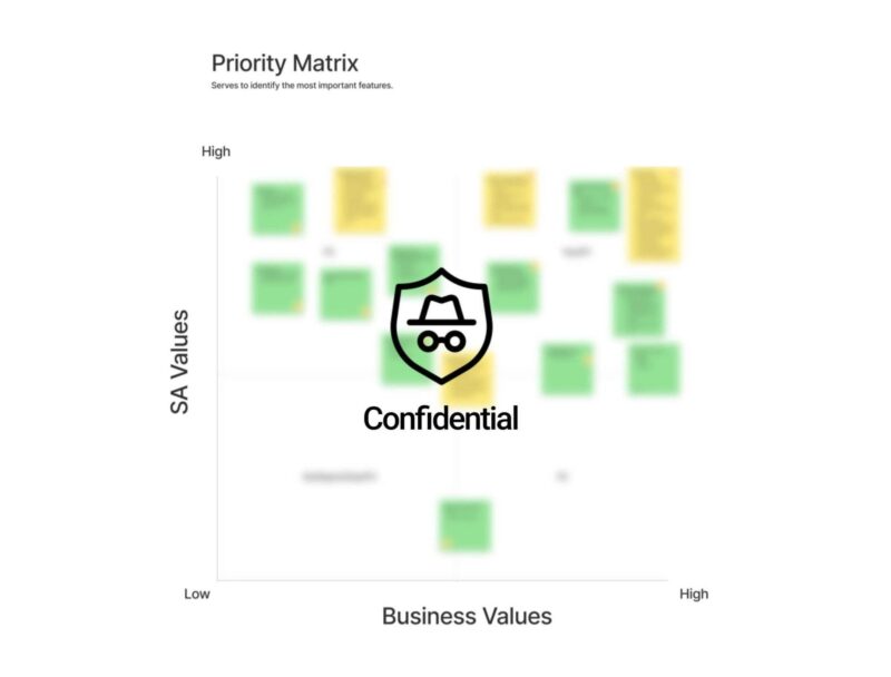
We conducted a Priority Matrix workshop to identify which features were most important for sales associates, focusing on content organization and feature accessibility.
-
Sales associates were asked what features they used most frequently.
-
We also looked at what features were missing and needed improvement.
-
The items we selected were based on the needs of Sales Associates.
By aligning our design with the specific needs of a luxury retail environment, we developed a solution that streamlined the user journey while maintaining the high-end, personalized service expected by Neiman Marcus clients.

Wireframes and Prototyping
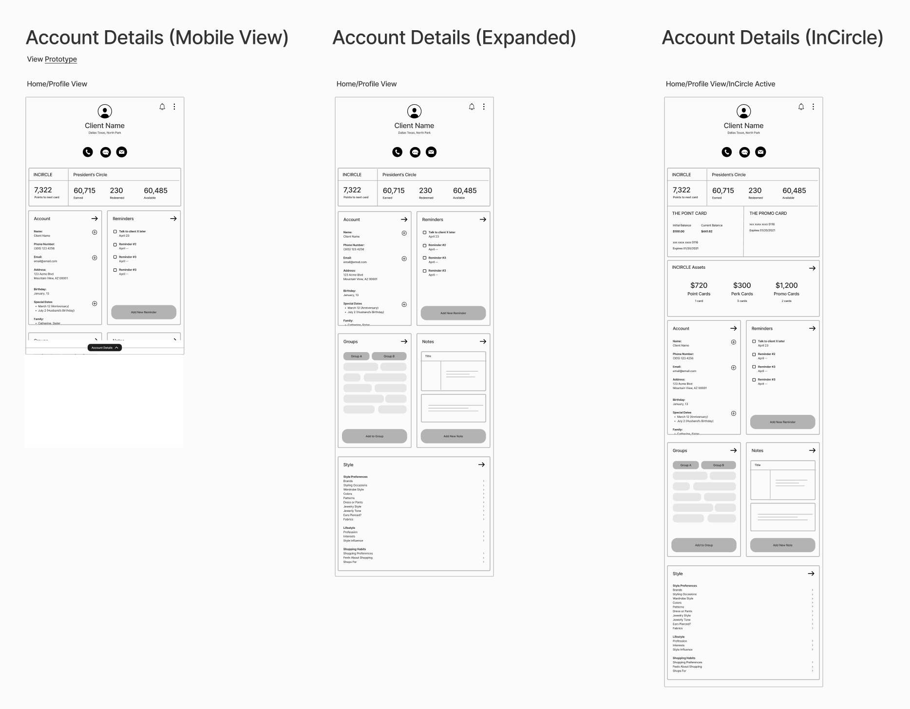
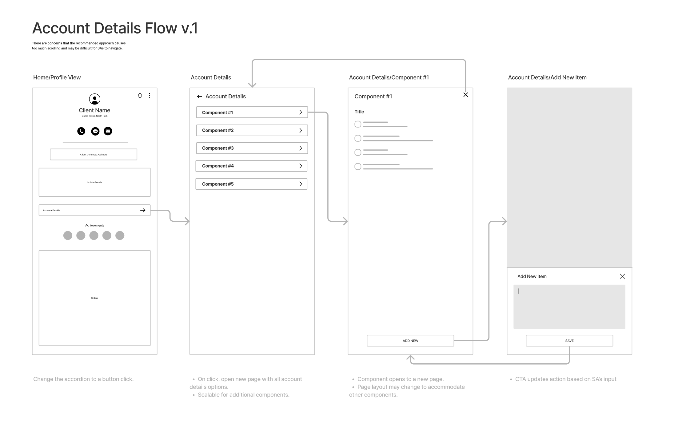
To map out content hierarchy and improve information accessibility, we created wireframes that prioritized ease of use.
A mobile-first approach ensured that the design was fully responsive across devices. We also developed a fully interactive prototype using Figma, which allowed us to test various iterations and gather feedback from sales associates and product leads.
This iterative process helped us refine the design based on real-world needs and user preferences.

Results and Impact on Customer Engagement
The redesigned client profile significantly improved the visibility of client data, enabling sales associates to provide more relevant and personalized recommendations.
The streamlined interface reduced navigation friction and led to faster, more efficient service. Phase 1 of the rollout was a success, with increased client engagement metrics and positive feedback from the sales team.
We are now preparing for Phase 2, which will focus on refining content recommendations and further enhancing the personalized shopping experience.

Designs
By incorporating all feedback from the team, Sales Associates, and Product Leads, we ensured that the most important information was easily accessible and that the overall design was clean and intuitive.
Client
“It’s a lot better than what we had previously.”
Summary
The project was well-received by both sales associates and management. The success of Phase 1 has paved the way for continued development, with Phase 2 aiming to integrate even more advanced customer insights and content personalization.
By focusing on client profile redesign and luxury retail UX enhancements, we achieved our goals of improving both sales efficiency and customer satisfaction.

